Visualising what data Universities' hold
Opening doors on campus, tapping into lectures, using eduroam and logging in to single sign-on all are logged so the University can work out if you’re going to lectures, but what does this data actually look like?
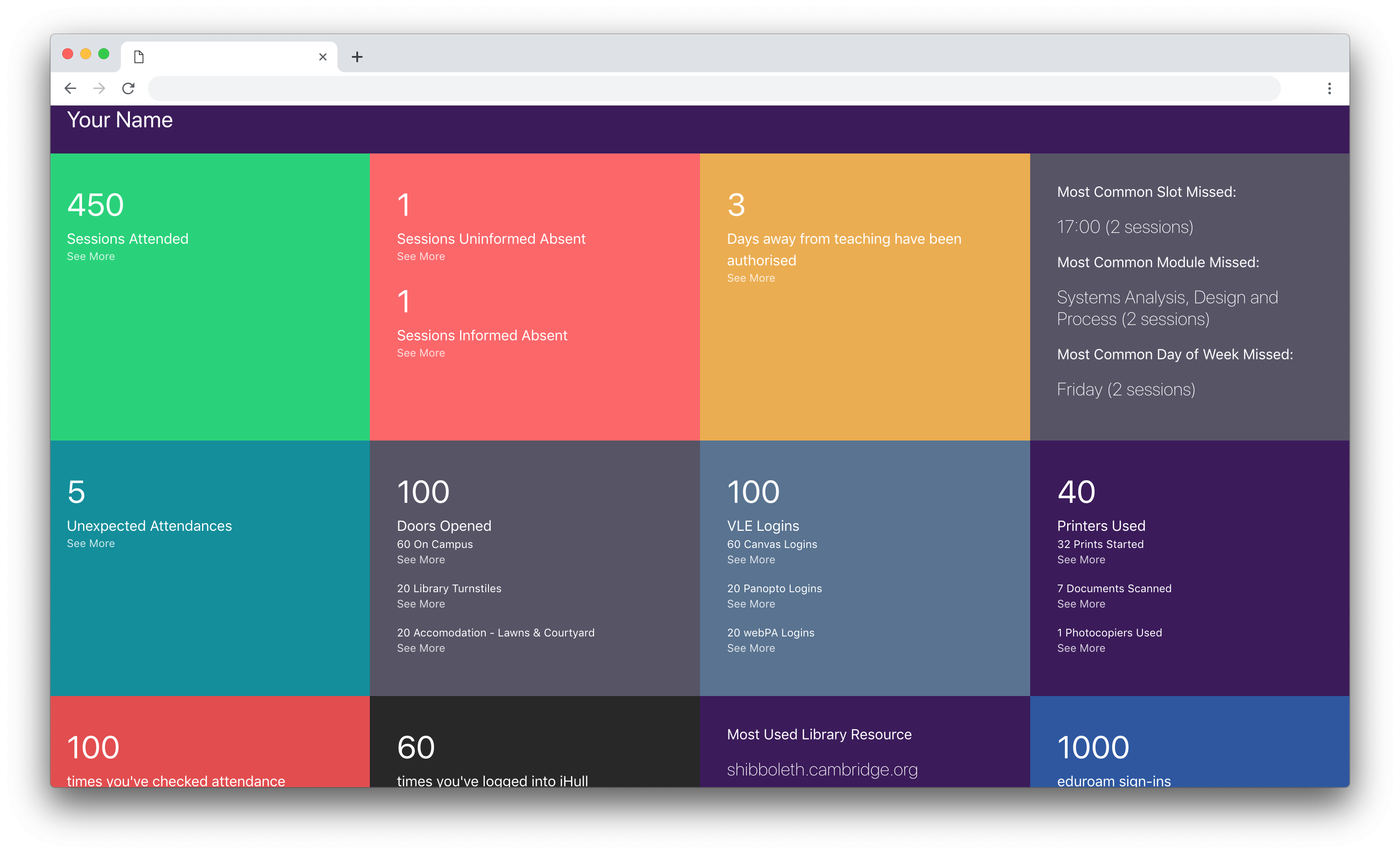
When I requested a list of lectures I was absent from this year from at University, I wasn’t expecting to get a 3500 row CSV back of all my activity at University. After I got over the sheer amount of data that I got, I decided it was time to do some visualisation on this data to get an understanding of it, breaking it down by categories, running analytics (like if there was correlation on any missed time-slots) and even the most commonly used University single sign-on resources.
I created a tool as a personal project that allows students to understand their own files and get their own page of tiles by uploading the file that their Student Hub will provide them of their own student record.
It’s a Node.JS Express application that takes uploaded CSVs and converts them to JSON objects, which are then processed and broken down by categories, analytics are performed before it’s passed back to express and shown in the front-end, with the original data file being deleted from the server immediately.
All the code is open-source and available on GitHub and I have a live instance that is deployed by Zeit Now’s Continuous Integration. Both the source code and the live instance are linked from the project page.
University of Hull branding and card likeness rights reserved Univeristy of Hull, their appearance does not represent the institution's endorsement.